This project uses public data from the "Real Estate Information Library" API, provided by Japan's Ministry of Land, Infrastructure, Transport and Tourism (MLIT).
With Python, I automated the full workflow: data ingestion, cleaning, aggregation, chart generation, and web publishing.
Covering six major prefectures (Tokyo, Kanagawa, Chiba, Saitama, Osaka, and Aichi), the project visualizes used condominium price trends by municipality and floor plan. It turns authoritative public data into accessible, intuitive market information for general users.
Problem Solved: Turning Public Data into User-Friendly Information
Primary data from government sources is highly reliable, but it is often delivered as raw CSV files or through complex API endpoints. As a result, it can be hard for non-specialist users to understand market trends at a glance.
Manually compiling millions of transaction records into charts also takes substantial time and effort, making regular updates unrealistic.
This project addresses those issues with a programmatic data processing and visualization pipeline that automatically converts raw records into clear, easy-to-read charts.
Data Source: Real Estate Transaction Data from MLIT
To keep the analysis objective and accurate, the data comes directly from the official government API:
Data Source: Ministry of Land, Infrastructure, Transport and Tourism (MLIT) Real Estate Information Library API
Data Type: Used condominium transaction records (historical prices)
Volume: More than 1.3 million historical transaction records after filtering for the target areas
Attributes: Transaction price, transaction period (quarter), municipality, floor plan, construction year, etc.
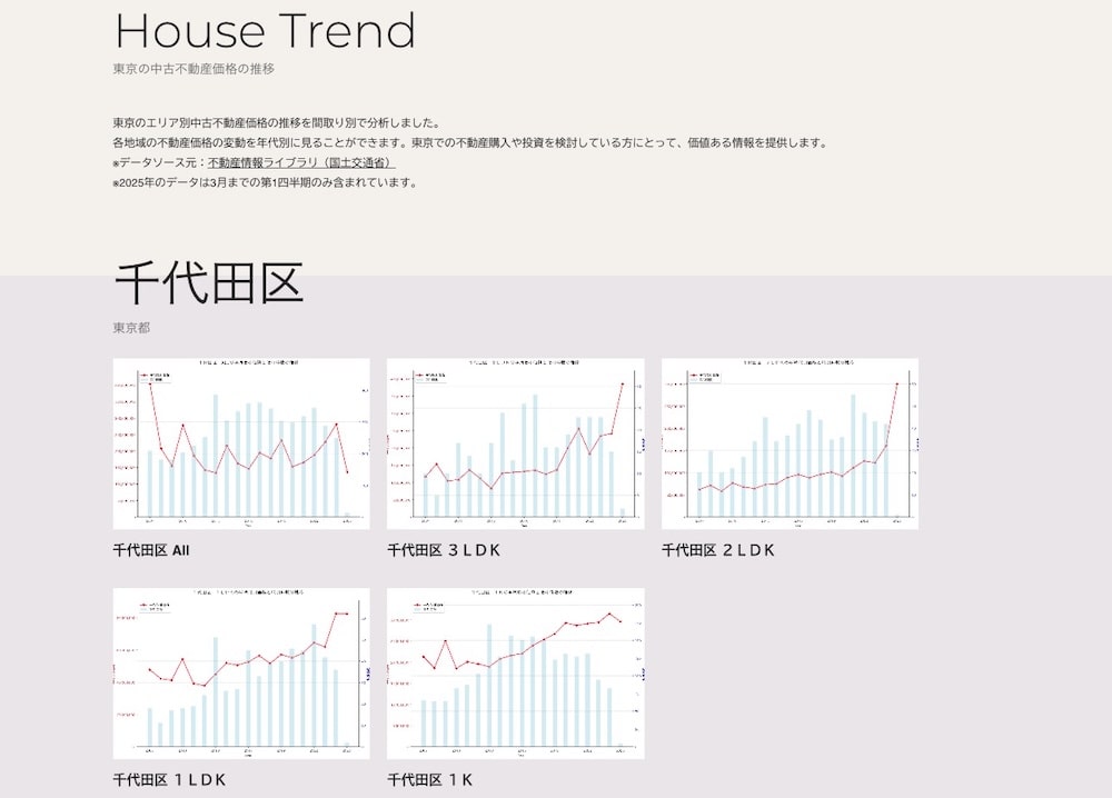
Visualizing Price Trends by Area and Floor Plan
To provide more useful insights than simple prefecture-wide averages, the data is segmented and visualized at a more detailed level:
Municipality-Level Breakdown: Visualizations show detailed price histories for individual municipalities within each prefecture.
Floor Plan-Based Aggregation: Transactions are grouped into single-person layouts (1K), small-household layouts (1LDK to 2LDK), and family-sized layouts (3LDK+), with median price trends calculated for each group.
Bilingual Delivery: Pages and charts are generated in both Japanese and English for domestic homebuyers and international investors.
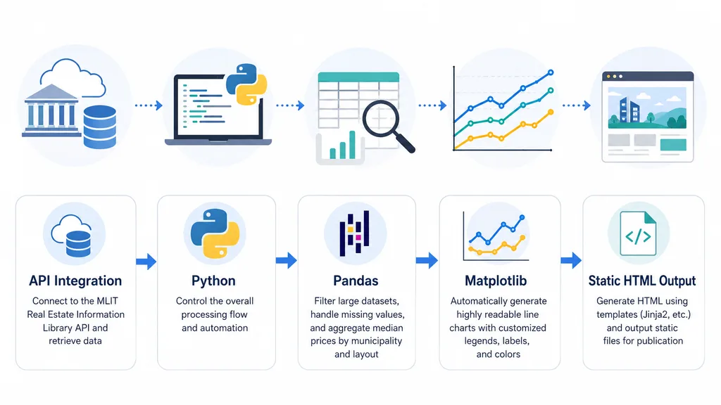
Technology Stack and Implementation Details
Architecture diagram of the automated pipeline combining Python, Pandas, and Matplotlib
This project was built around Python to automate the workflow from raw data processing to static frontend output:
Python: Orchestrates the overall pipeline and script execution.
Pandas: Handles large-scale data cleaning, filtering, and median price calculations by municipality and floor plan.
Matplotlib: Generates readable line charts with customized labels, legends, and styling.
API Integration: Connects to the MLIT REST API and retrieves transaction data.
Static Site Generation: Programmatically compiles generated charts and metadata into static HTML templates.
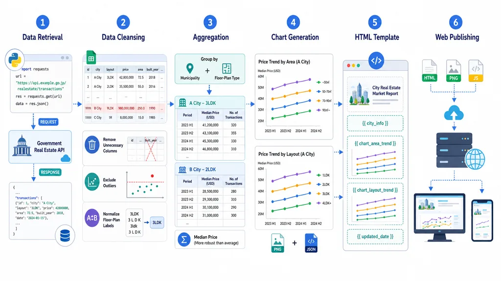
Processing Flow: From Data Collection to Web Publishing
Flow from API-based data ingestion through cleaning, aggregation, static HTML generation, and publication
The automated pipeline runs through these steps:
Data Ingestion: Sends REST API requests to the MLIT portal and retrieves raw transaction data for selected regions.
Data Cleaning: Discards unnecessary fields, handles missing values, and normalizes floor plan categories.
Aggregation: Calculates quarterly or semiannual median prices for each municipality and floor plan type.
Visualization: Generates and saves trend line charts with Matplotlib for each dataset.
Template Compilation: Combines charts and metadata with prebuilt bilingual HTML templates.
Deployment: Uploads the compiled pages and image assets to the web server for public viewing.
Generated Outputs and Visualization Scale
Using automated scripts, I generated a large visualization library that would be impractical to build manually:
Total Visualizations: 3,804 unique line charts.
Prefectural Scope: Six major metropolitan prefectures.
Municipality Coverage: 317 municipalities.
Floor Plan Variations: Breakdowns across multiple floor plans (1K to 4LDK+) and overall market averages.
Value Delivered by This Project
Authoritative Data Presentation: Turned raw, complex administrative records into clear visualizations that non-specialists can understand.
Repeatable and Scalable Pipeline: Because the data flow is codified, updating charts for new quarterly releases only requires rerunning a script.
Granular Utility: Goes beyond broad market statistics by providing municipality-by-floor-plan trends that can support buying, selling, and investment decisions.
End-to-End Execution: Demonstrates solo implementation across data engineering, visualization, static site generation, and frontend deployment.